January 31, 2022
When storytelling meets PowerPoint
Share this article

The benefits of storytelling can never be overrated. Stories help you connect with your audience, get their attention and put your best foot forward. In the world of marketing and business, you can use storytelling (not only in your PowerPoint presentation) to:
Of course, you don’t need a book (or even an article) to tell a story. In fact, storytelling can be exploited across various communication channels, and PowerPoint presentations are no exception. In a few moments, you will discover some practical PowerPoint tips and guidelines that will help you create more engaging and compelling presentations. Let’s get right to it!
If you want to leverage storytelling in PowerPoint, you have to start with a plan and a finishing point. What do you want to achieve? What do you want to communicate to your audience? You need to have the answers to these questions even before you open your PPT file. Knowing the purpose of your presentation will help you set the tone, draft the content plan, and grasp the big idea.
Suppose you want to motivate your employees to participate in a new program or simply to work more effectively. You should focus on why it’s important to them. They don’t want to hear about the company’s history or achievements. They want to know what THEY can achieve. For instance, you could picture a not-too-distant vision of promotion, raise, or other vital benefits that will encourage them to do more for the company. But to achieve this goal, you need to know your audience.
Focus on what is important to the listeners of your presentations. Concentrate on them – their problems, needs, and expectations. That’s the best way to get someone’s attention. Today, selling is not about talking; it’s about listening. And you need to “be all ears” by devoting your presentation to your audience. Not to the greatness of the company, because that’s plain boring. Ask yourself a few vital questions:
With this knowledge, you can go to the next point.
You already know what to communicate and the needs of your audience. Think about how you could combine these two elements into one coherent narrative. At this point, you can think of such elements as:
Have you ever wondered why Hollywood movies are so successful? That’s because the vast majority of them follow the specific structure: Setting the tone, themes, and characters in the first five minutes of the movie, and then developing the action within the strict three-act formula, using initiating events, complications, and climax points. The three-act structure is one of the most popular schemes for engaging storytelling, not only in PowerPoint. But, of course, it’s not the only one.
We encourage you to find out more about these structures and their usages:
Of course, there are many more storytelling structures you can use. We can’t fit them all in one article. If you want to discover more storytelling techniques, take a look at VirtualSpeech.com.
Your story should be clearly visible and easy to follow. If you pick difficult examples or a scheme that doesn’t fit your situation and goal – you won’t be able to get anyone’s attention. Now, how can you make your story easy to follow? You could put the most important elements of it in the headlines/slide titles. Copy all of them to notepad and see how they look together. You can also use the outline view in PowerPoint.
Does it all make sense when you look at it from this perspective? If yes, you’re on the right track! In one of our past articles about PowerPoint tips and guidelines, we emphasized the importance of navigation slides. You can use them to tell your story, too.
For the same reason, you can’t overload your slides. If you end up with a difficult-to-read wall of text, no one will be bothered to dig deeper into your story. When it comes to PPT presentation design – less is more.
Smart use of visuals (photos, infographics, charts, animations, maps) will help you maintain listeners’ attention and convey your message. Visuals are also perfect to:
Check your presentation and see what can be shown in a visual form. Again, you should not overdo that. Too many visuals will only help you achieve one goal – make everything illegible. Visuals are helpful, but they can quickly overwhelm your audience. Also, make sure all slides work together in terms of brand consistency.
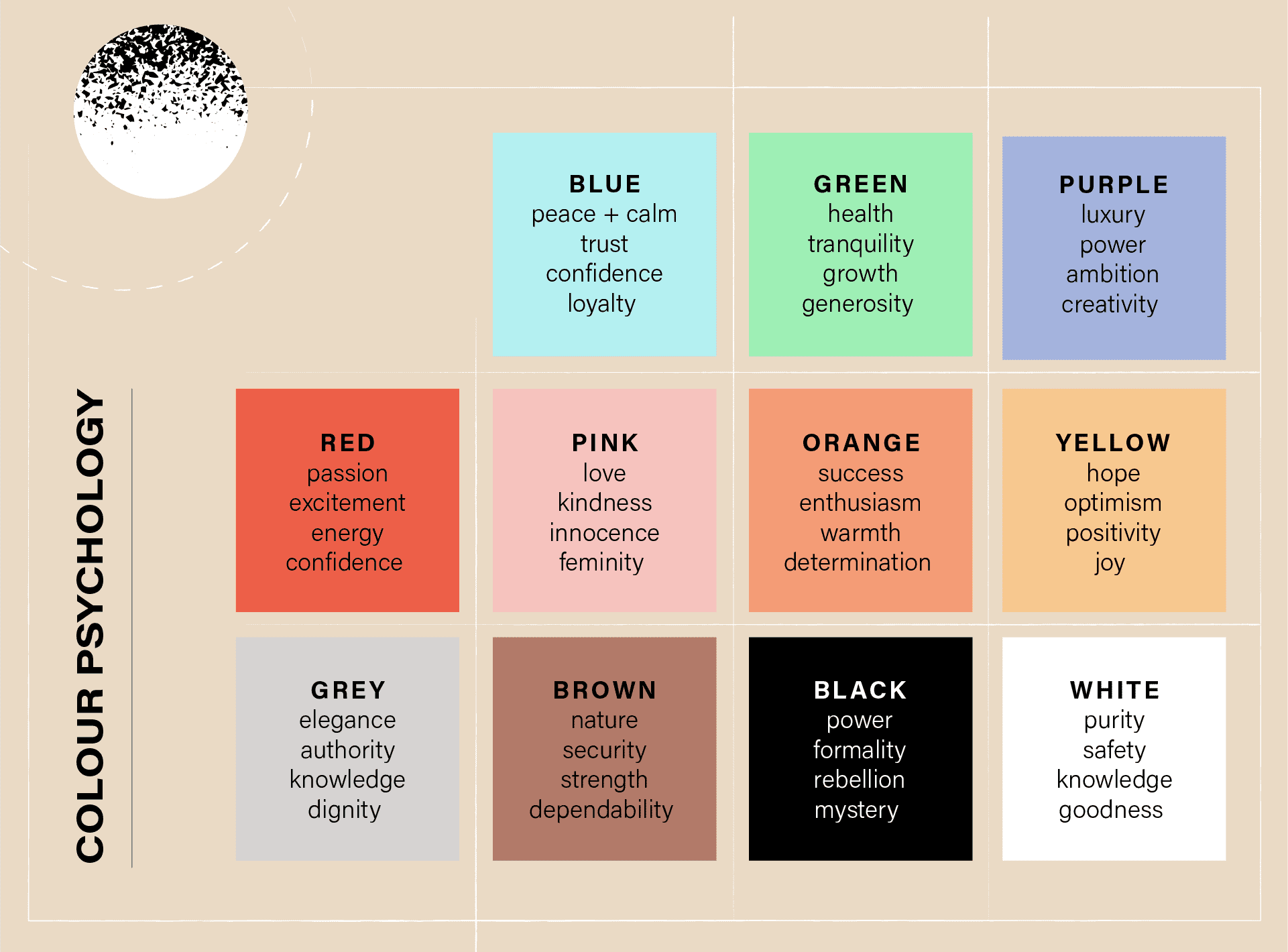
It’s the same thing with fonts and colors. They have to be adjusted to your brand identity and the purpose of your presentation. This chart will help you see what different colors communicate. Go for them if you want to evoke specific emotions or attitudes:
Lastly, a piece of advice: If you think that your infographics and charts don’t contain enough information, use footers or divide information into more slides. If there’s too much data on one slide, no one will remember it anyway.
And what about animations? They are extremely versatile but also difficult to use. They help you show the chronological order of your perfect presentation, emphasize a valid piece of data or even amuse/shock your audience. But if there are too many of them or they are chaotic, it’s all in vain. People will lose their attention and spend the rest of your presentation trying to figure out what that last animation was all about. It’s the same story with videos and sound effects – they can be helpful, but to an extent.
Before you use your presentation, review it thoroughly. It’s usually best to take at least several hours to break after finishing work to have a second glance. This way, you can take a fresh look at your presentation. Does it all make sense? Is it legible and easy to follow? If yes, great! You can now proofread it and show someone else to check it once again for you. Remember to save your file in a universal format and check the device you’re going to use during the actual presentation.
Our Presentation Design Services team helps companies worldwide create compelling presentations that help them achieve their goals and sell products. Contact us for details and see how versatile and useful these “ordinary” PowerPoint presentations can be.