March 21, 2023
Wayfinding – a comprehensive guide
Share this article
Finding your way in an unknown building or environment can be tricky, especially if you’re there for the first time. Fortunately, finding your way can be streamlined through various tools, among which the discipline known as wayfinding is the most important one. In this post, we will show you (with examples) what wayfinding is all about.
Imagine a typical situation – you enter a large building or go to the business area. You’re looking for a specific company – located in a specific building on a particular floor. How do you get there? You can use guidelines on the company’s website (provided they offer such a convenience), download or use a map on your smartphone, or use signage that’s most likely available in the area. This signage, helping you find your way to the desired place, plays a major role in wayfinding.
In general, it’s a discipline or a process people use to locate themselves in a given physical space and navigate to a desired location. For us, as branding professionals, wayfinding is an essential element of branding, especially for companies operating at least partly from the office. Typically, we can divide the process of finding a way into four major stages:
Going further, wayfinding comprises three basic tools:
Let’s have a closer look at each tool.
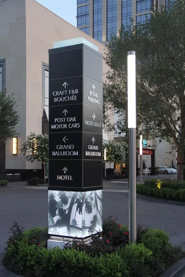
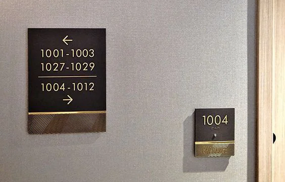
The first kind of wayfinding tool is based on physical signage located in different places, e.g., near the entrance, on every floor, in or near elevators, etc. You can place signage on the ground, on a wall or as a standalone totem. Moreover, such signage can be backlit to offer support 24/7.
Image source: https://www.pinterest.ca/pin/the-post-oak-hotel-at-uptown-houston-placemaking-totem-sign–151433606207351692/
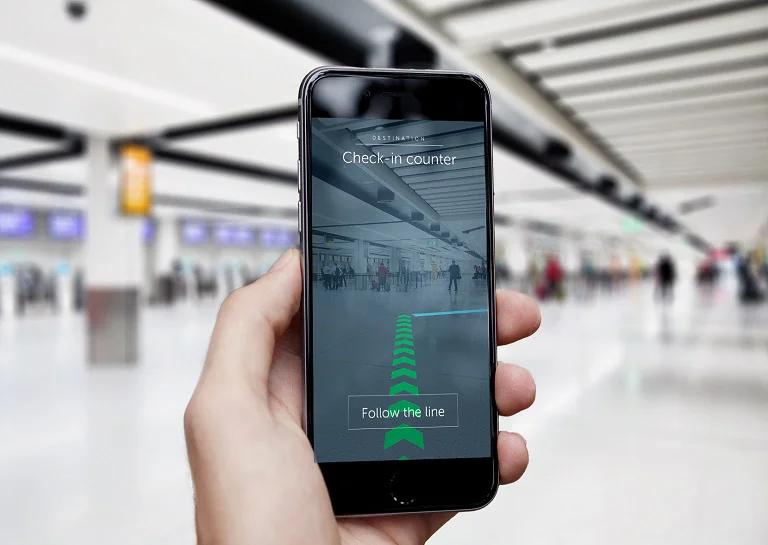
Finding your way at a large airport can be tricky. That’s why, in 2017, two London airports, Heathrow and Gatwick, started offering the world’s first wayfinding app based on augmented reality (AR). This app uses beacons located in different places within the airport, helping locate each user and direct them to a desired destination (e.g., a gate or a check-in counter).
Image source: https://interestingengineering.com/culture/gatwick-airport-uses-augmented-reality-help-catching-flights
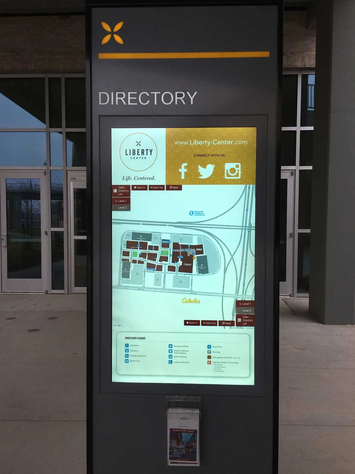
They are a common sight in every shopping mall, but also in other locations. Interactive kiosks help visitors, passengers and customers:
Image source: Source: https://cloud.googleblog.com/2016/01/Madison-Fifth-builds-interactive-mall-experiences-for-kiosks-and-mobile-using-Google-Maps-APIs.html
For instance, Liberty Center in Cincinnati uses this kind of direction for everyone who visits the place. Moreover, you can easily integrate their system (delivered in cooperation with Google) with mobile devices (without downloading any software). Liberty Center’s kiosks detect a given visitor’s location and give them interactive walking directions in real-time. In other words, this system works like an indoor GPS.
Generally speaking, we can distinguish three basic types of signs used for wayfinding purposes:
Directional signs (directing visitors to a specific location)
Identification signs (describing the current location)
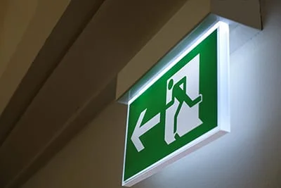
Warning signs (indicating safety/emergency solutions)
In a sentence? Basically, wherever it’s easy to get lost. Typical applications of wayfinding tools comprise the following locations:
A wayfinding system has to be, above all, useful and intuitive. Sticking to the principles we outline in this article will help you ensure the majority of your visitors/customers have no problem finding their way or getting to their destination.
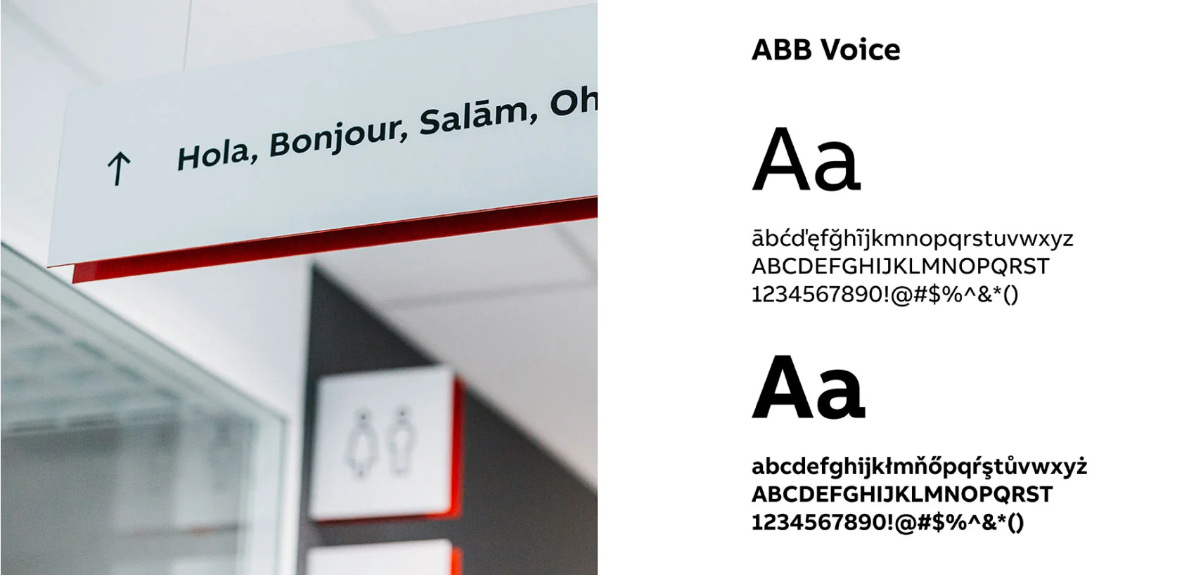
You need to remember that wayfinding is an integral element of branding, which in turn, is a comprehensive process of building image and brand awareness. That said, good wayfinding is based on an existing brand or creates a separate building’s brand. It touches on the facility’s history, place, city, and purposes and uses these elements to create something new and creative.
That’s exactly what we did with our wayfinding signage system for ABB. Read more about this project.
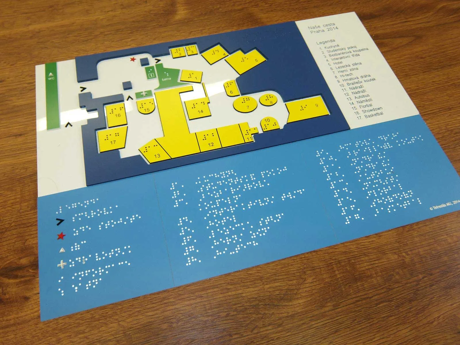
Before you start designing any part of your wayfinding system, you need to analyse the premises. Where is the wayfinding information needed? What kind of wayfinding system will work best in your case? Do you have to include some special needs of people visiting your building (e.g., visually impaired or disabled)?
Image source: https://www.teiresias.muni.cz/en/library-and-publishing/services/producing-navigation-signage
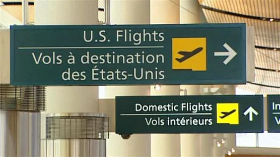
Firstly, always use a straightforward design for your signs so that many people can easily understand them. Secondly, don’t include too much information; stick to short messages and names. Thirdly, use a sans-serif typeface, which is usually more legible. Moreover, use wide letter proportions and clear spaces to ensure good readability. Bilingual signage is also a good idea if you know people are speaking different languages in your building. Here is a good example of a Canadian airport with signage in two languages – English and French:
Image source: https://www.pinterest.ca/pin/kelowna-bilingual-signage–559783428682691326/
As you can see, the sign also includes a commonly-understood icon of a plane taking off. These icons play a crucial role in every international environment.
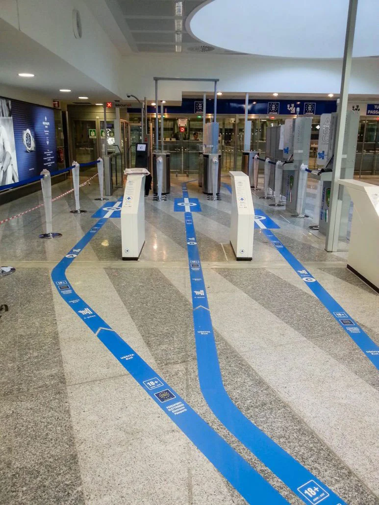
However, location is also important. In general, signage should be located in sight so that it can be quickly located. In addition, you can also consider using non-standard locations such as the ground/floor. Here is a good example of such signage used at Milano Malpensa airport:
Image source: https://www.seberg.it/en/modular-signage-for-milan-malpensa-airport/
Such signs can be very useful if you want your visitors to follow a specific path to their destination, for instance.
Colours play a big role in all safety signs:
When it comes to wayfinding, you have more flexibility. However, it is important to use colours that enable a clear and quick understanding of what you want to show or convey. Ensure the contrast is sufficient and that the used colours are not aggressive (trying to read signage made in aggressive, vibrant colours is tiresome).
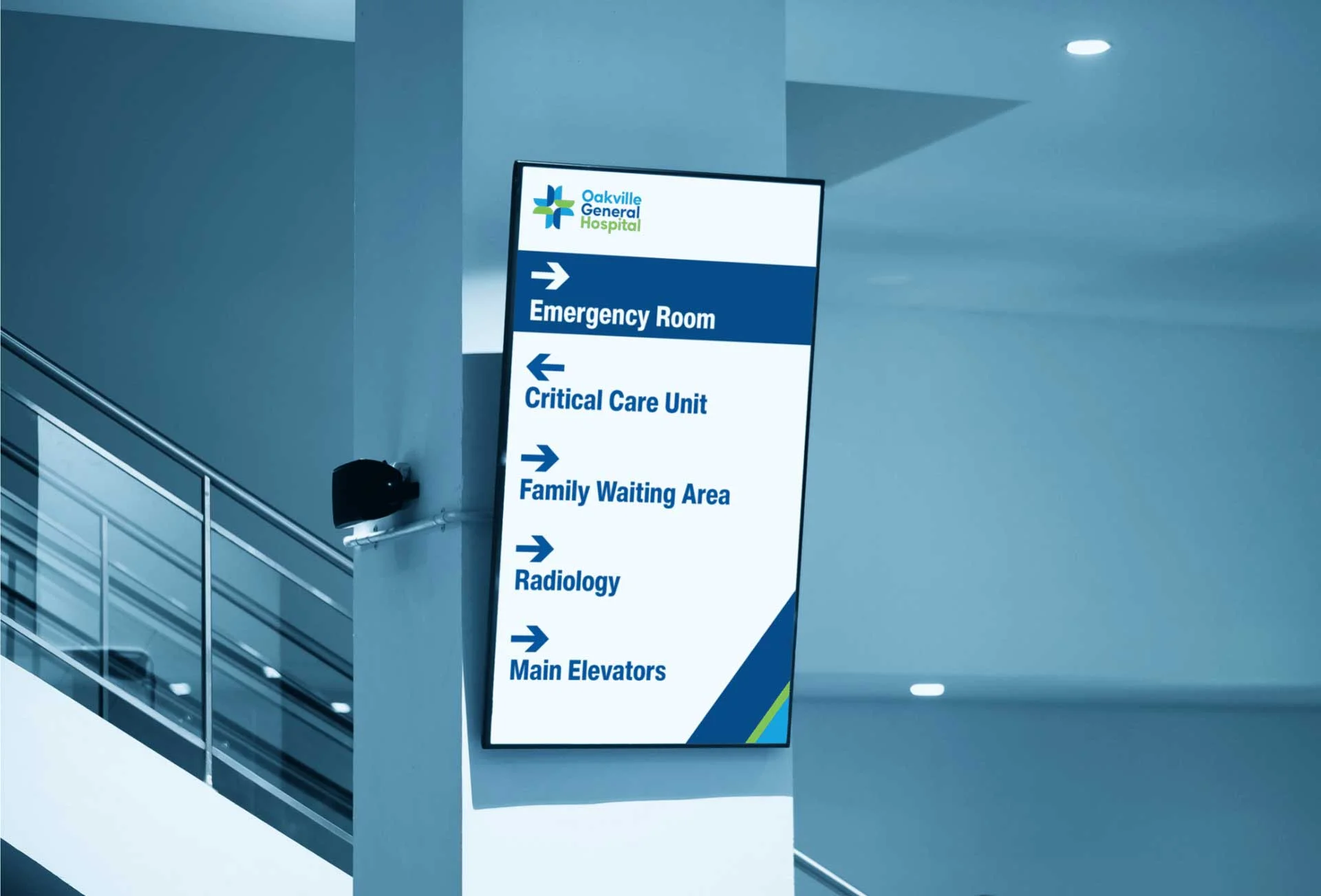
Additionally, it’s better to use calm, earthly colours in places like clinics, hospitals, SPAs, etc. where you usually want people to be calm and in a good mood.
Image source: https://www.digitalsignagetoday.com/blogs/top-10-ways-to-use-digital-signage-in-a-hospital-2/
Every element of your wayfinding system should be designed in the same way. The human brain looks for patterns everywhere. Using different signs, colours or fonts will only confuse your visitors.
Gestalt psychology focuses on how the human mind organises and interprets visual data. We can distinguish six crucial Gestalt principles that are used in wayfinding and design in general:
There are several benefits of a well-designed wayfinding system:
In conclusion, our experience here at Admind shows that more and more companies discern the potential of a well-designed wayfinding system. They start treating it as an internal part of their branding. From our perspective, that’s the best approach you can adopt.
If you want to design a wayfinding system for your company:
This way, you will make your building/facility safer and easier to navigate. And that’s the whole point of every signage system out there.