Energy Efficiency Movement – branding a collective force
Share this article
- Filter Name
-
Client
Energy Efficiency Movement
-
Industry
Industry Associations

Background
Our task was to expand the visual identity by creating additional graphic elements and rules of use, utilizing existing components such as the logo and color palette. Through creative development, we turned these elements into an inspiring story communicated through numerous branding materials. This effort made the brand more coherent, positioning it as an expert in its field and perceived as innovative and creative in conveying its mission.

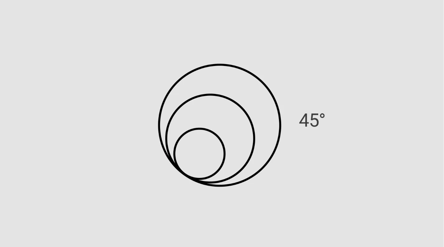
The impulse
The Impulse was created to elevate the EEM brand, symbolizing the expansion of the initiative onto new materials and digital platforms. Additionally, it embodies the spread of action contributed by the Movers, indicating a ripple effect of willingness to act and propagate positive change globally.
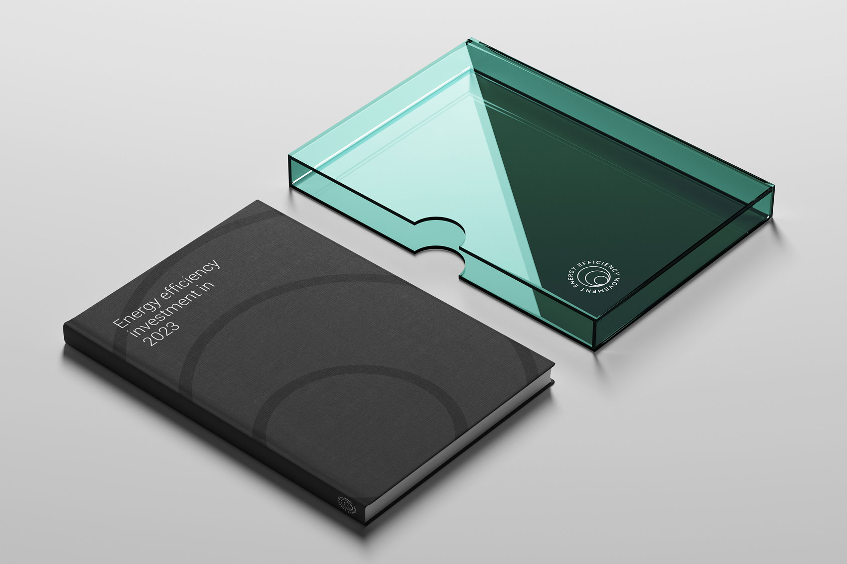
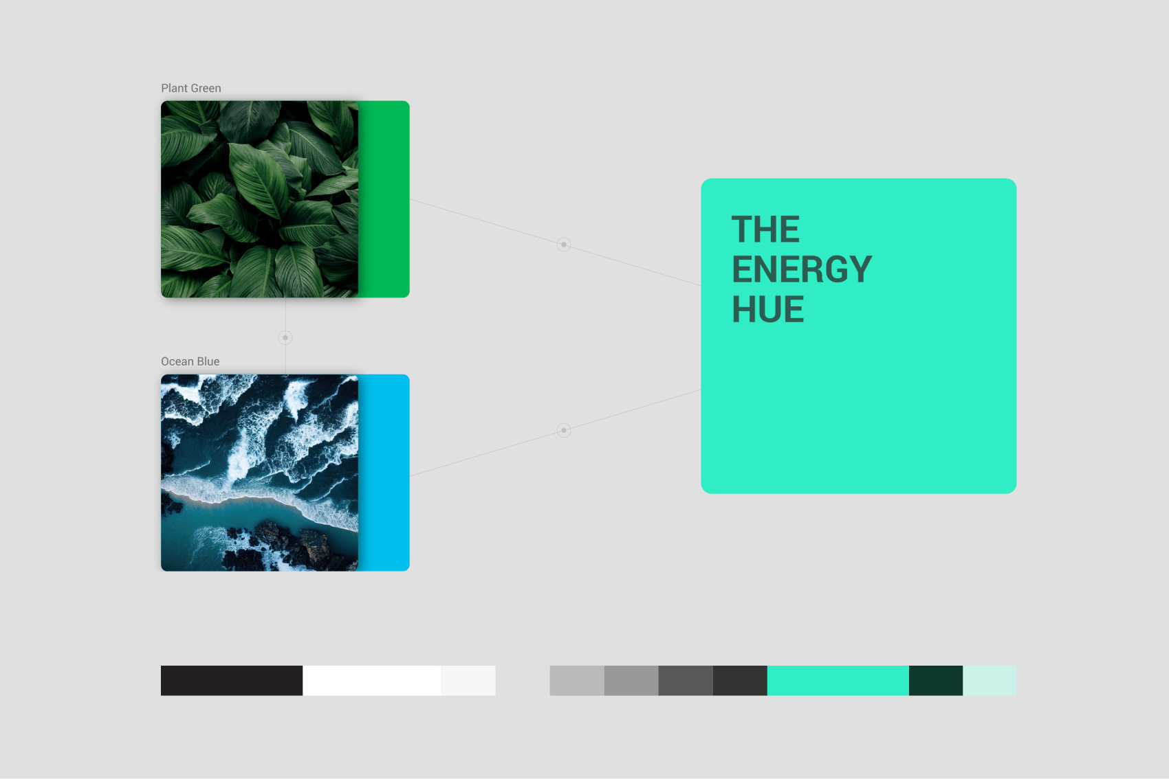
Color
Derived from the original EEM grays, the color palette is professional, firm, yet serious. We systematized the shades and introduced a new, complementary color—the Energy Hue. This hue, a fusion of plant green and ocean blue, symbolizes the combination of two life forces. The Energy Hue serves as an accent color, enhancing branding materials and highlighting various charts and graphs.
Typography
To systemize the use of the Roboto typeface, we established simple rules such as sizing determined by the Major Third typography scale, selecting the correct font weight, implementing wider and manually adjusted leading for body copy, and avoiding ligatures for material consistency.


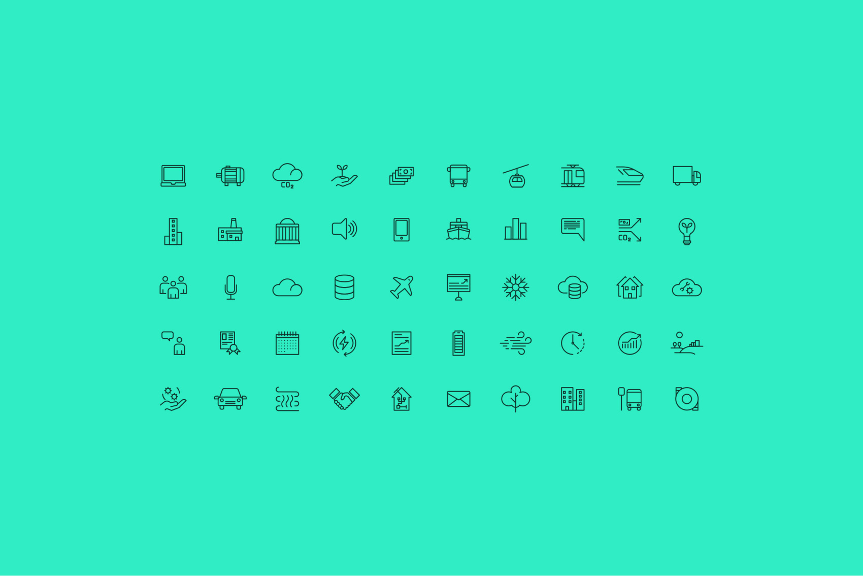
Icon System
Our pictogram design system draws inspiration from the EEM logo, reflecting a thoughtful analysis and deconstruction of its elements. Distilling rules and a graphic system from this examination, we focused on the logo’s foundational stroke found in its circles. Using this stroke as our building block, we created a precise grid with unique safe zone guidelines that directly correspond to the logo’s shape. This approach ensures seamless integration of our pictograms with the EEM brand identity, striking a harmonious balance between artistry and strategy.
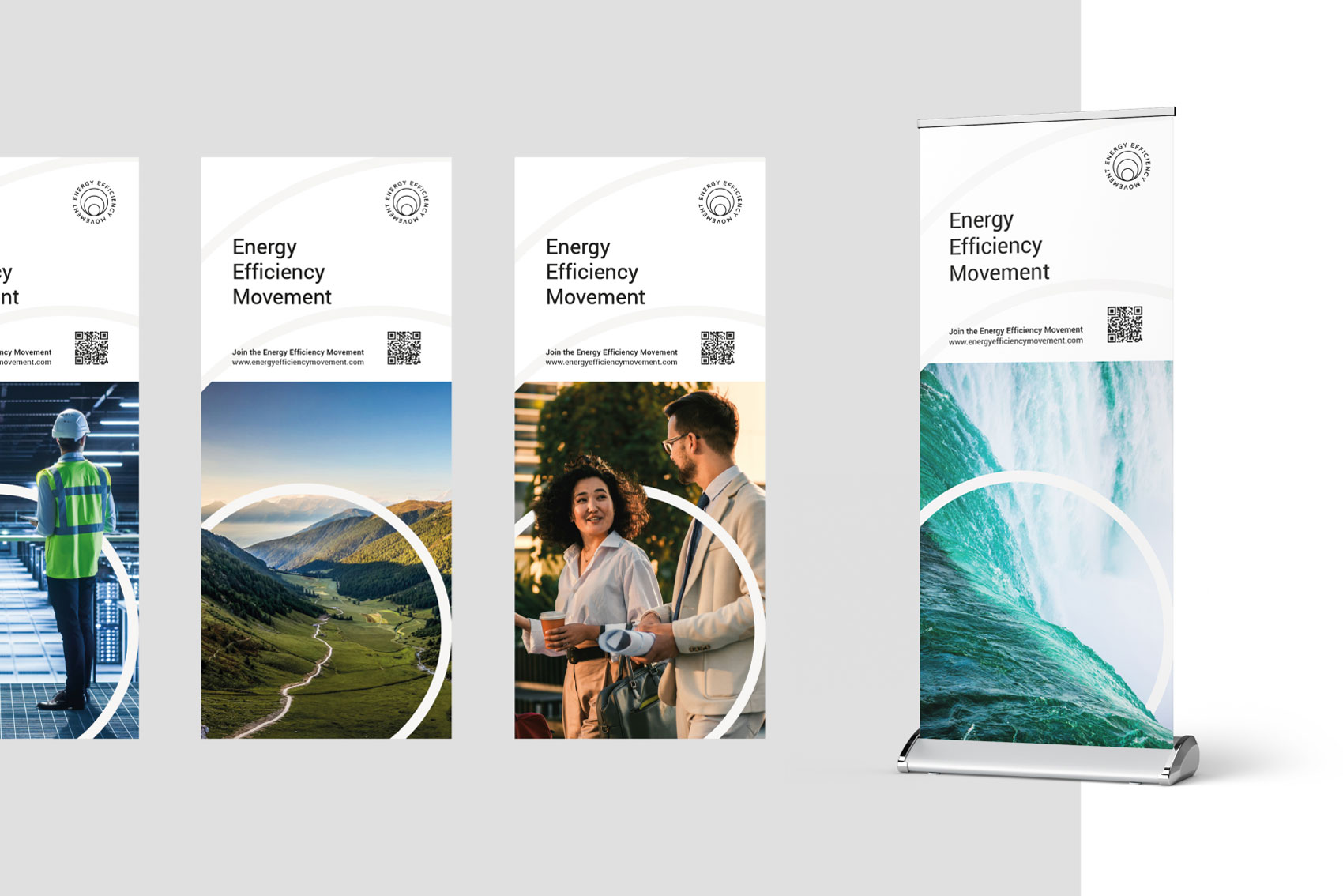
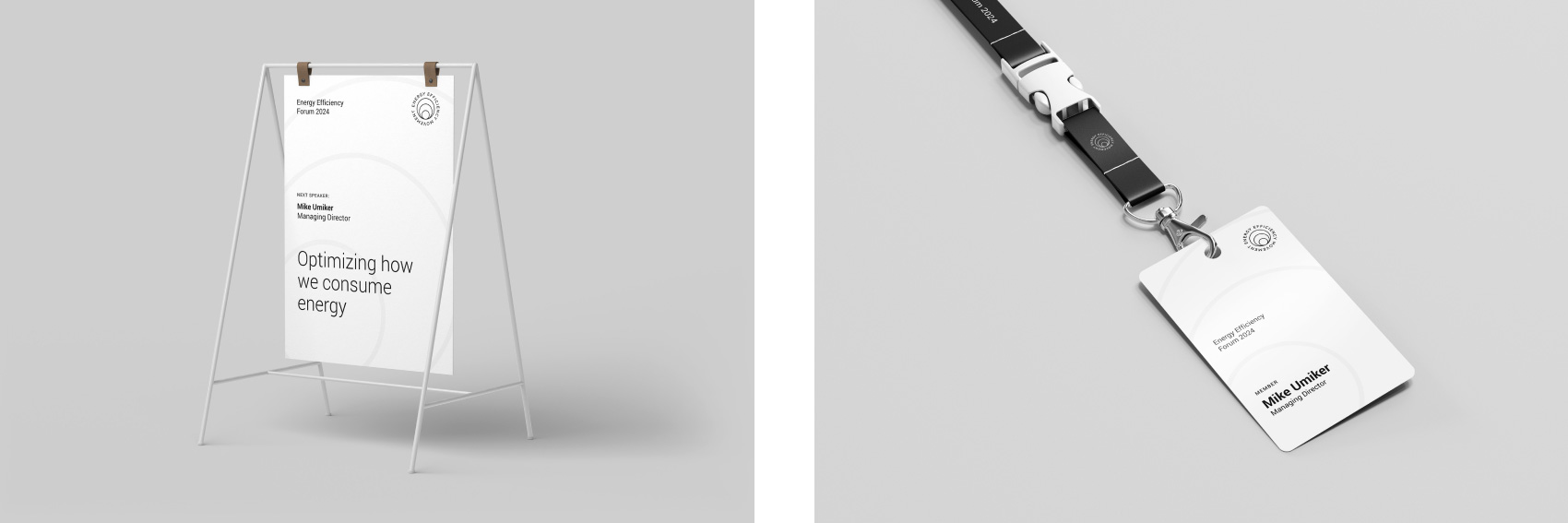
Additional assets
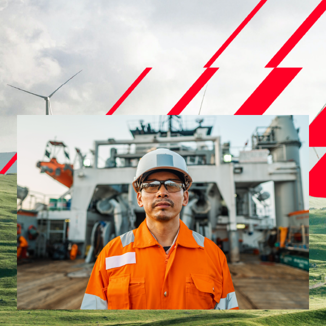
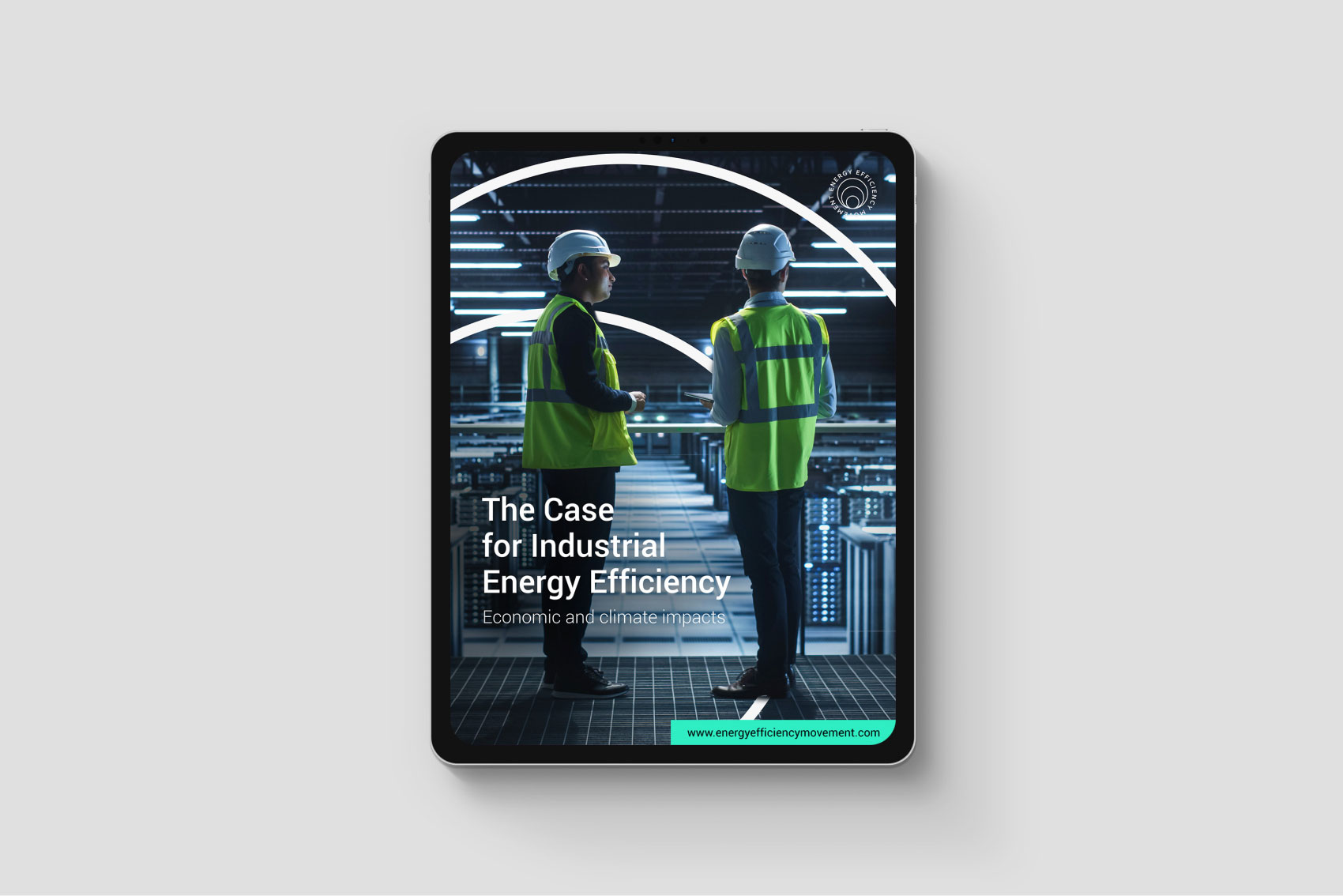
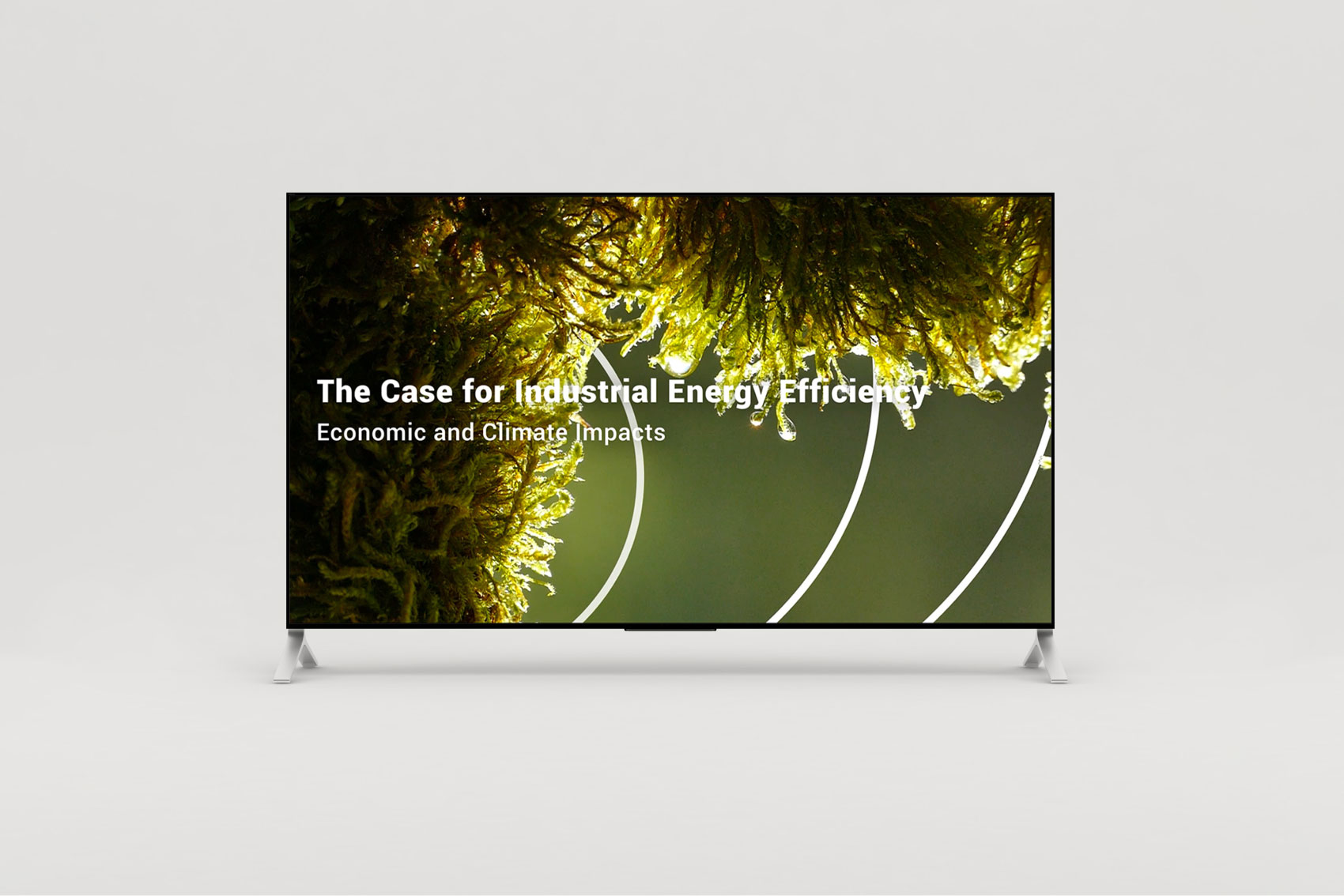
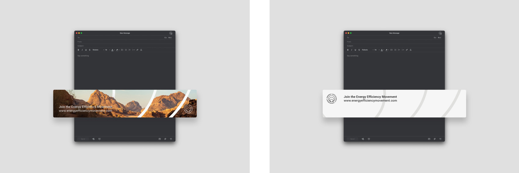
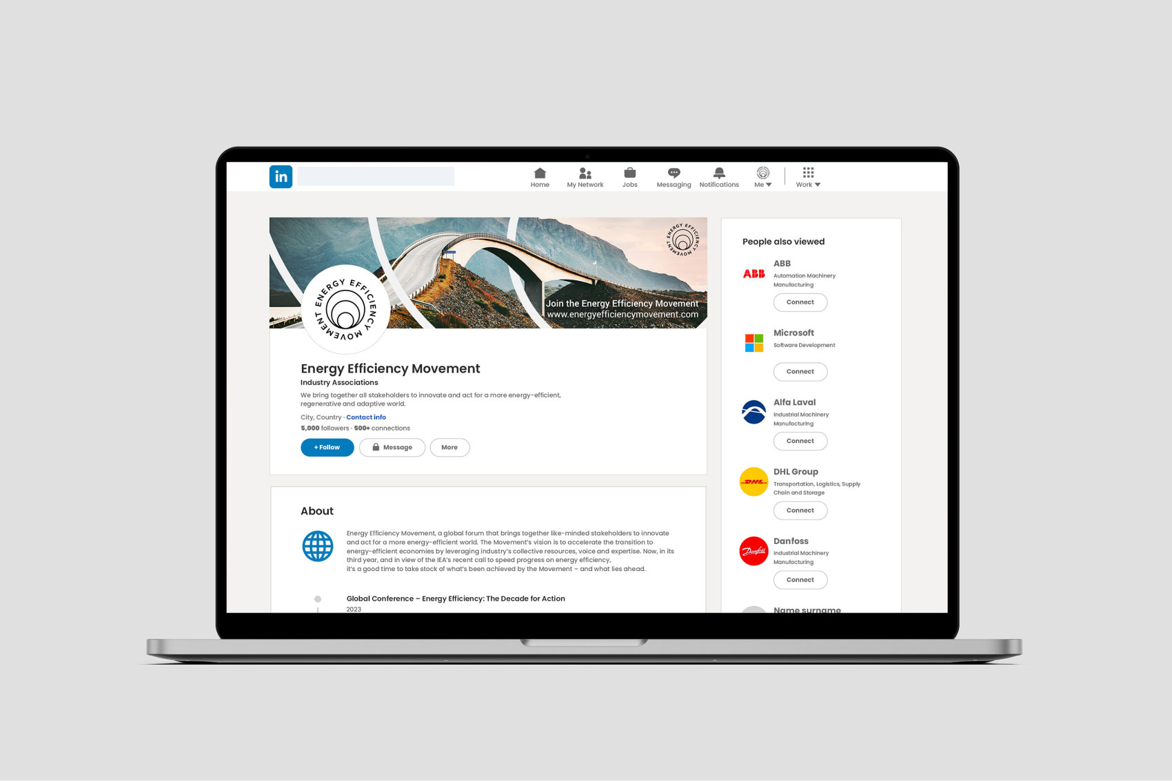
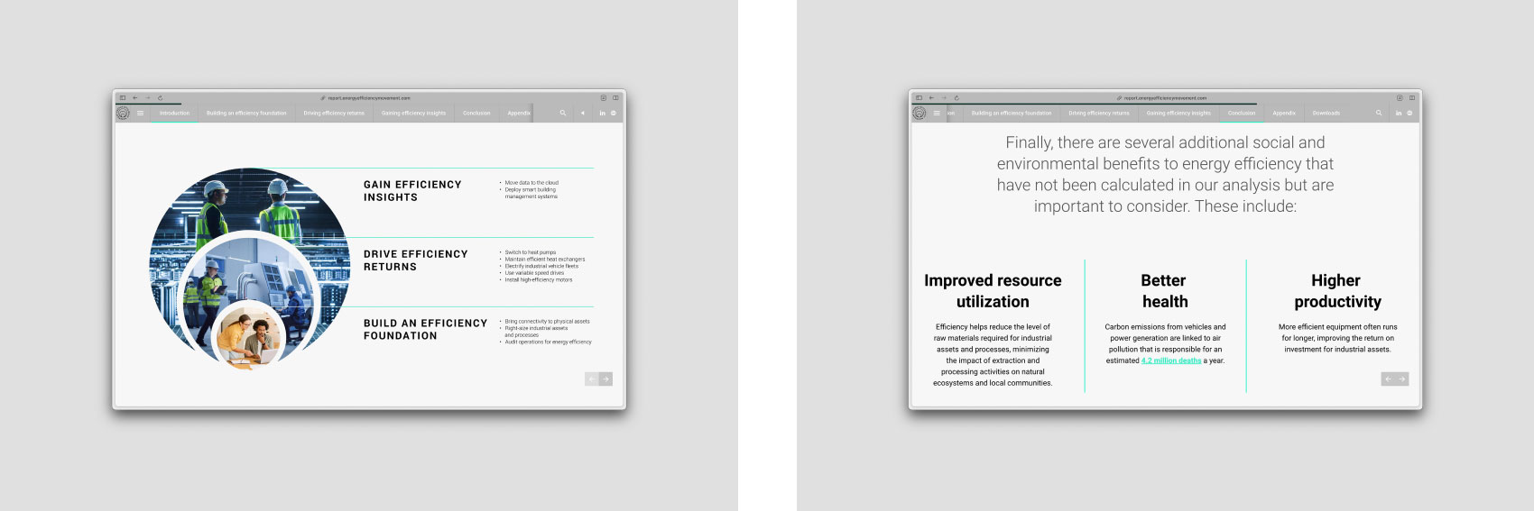
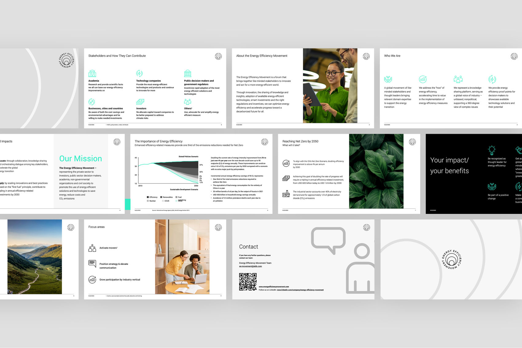
Combining all elements mentioned above with an extensive image selection, we created various marketing materials, including LinkedIn banners, email banners, and PowerPoint decks. EEM’s image library allows us to diversify materials while keeping the brand’s DNA at its core.
Results and next steps
The project continues to generate new assignments, with the client exploring additional applications for the “Impulse” theme. This underscores our dedication and proficiency in delivering comprehensive projects that positively influence the brand. We are delighted to collaborate with other Admind teams, affirming the adaptability and versatility of our services. Throughout the project, a significant effort and commitment were invested, resulting in over 30 key brand assets. These efforts reflect the intensity of the project and the team’s unwavering commitment.
Let's talk!