Scena STU – living identity
Share this article
- Filter Name
-
CLIENT
Theater Scena STU
-
Industry
Culture, Creative Sector, Entertainment
-
Awards
Creativity International Awards
Challenge
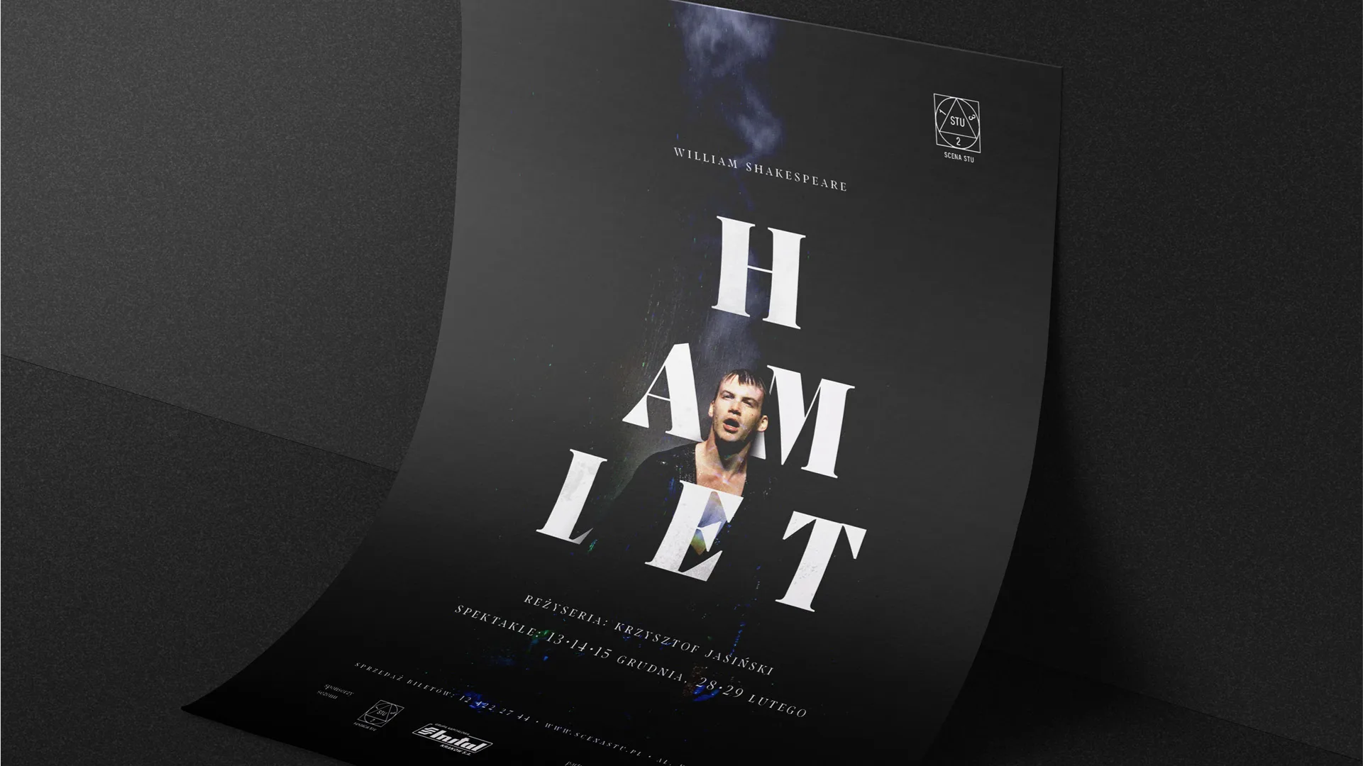
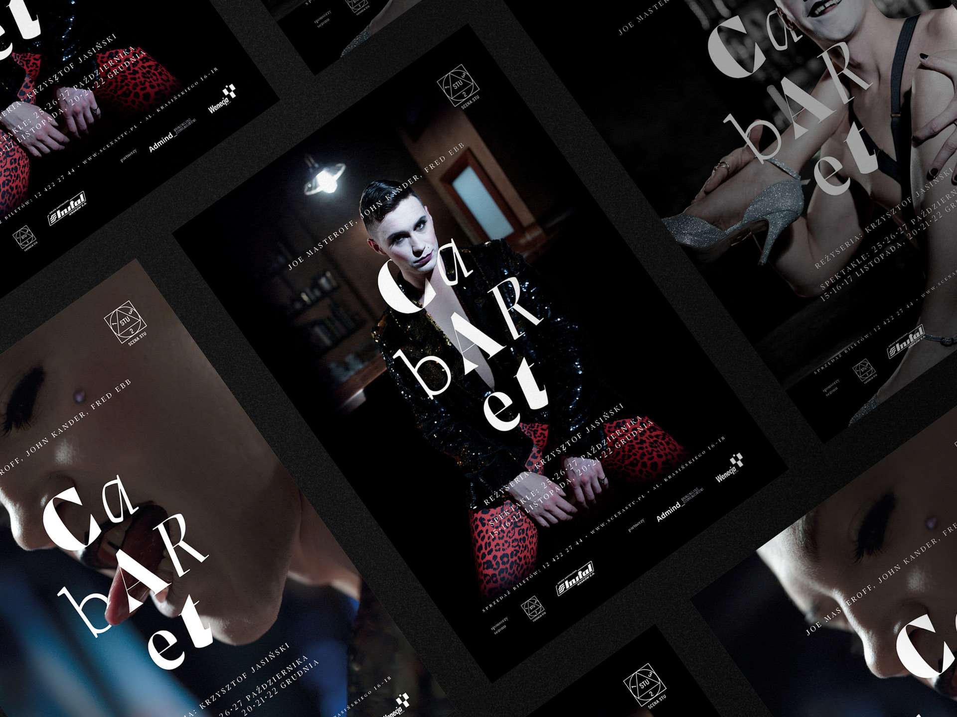
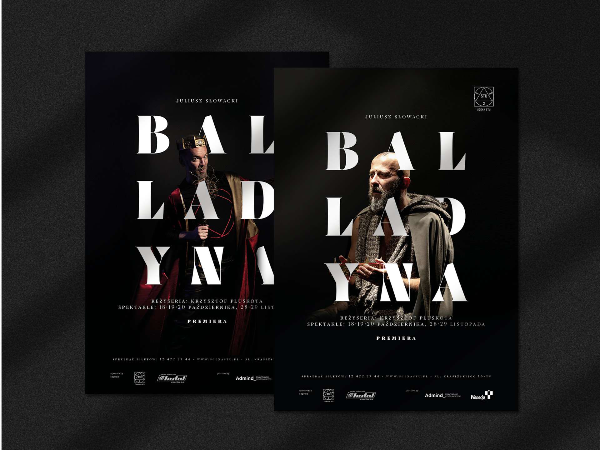
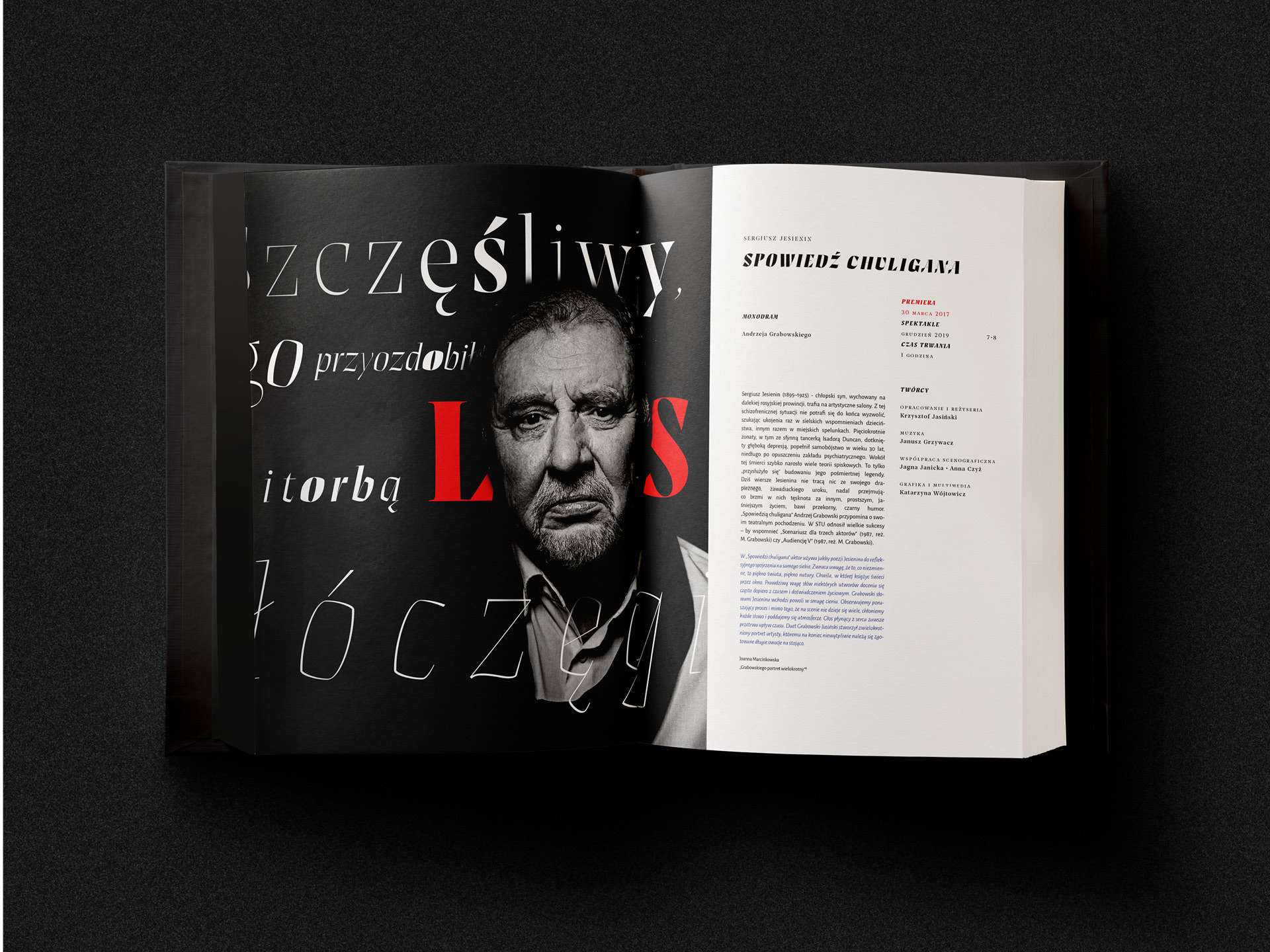
Since its beginning, the theater has been part of the alternative counterculture and follows this path until now. It was obvious our visual ideas had to fit in not only artistically but also ideologically. As a result, the key visual based on living typography came into existence.
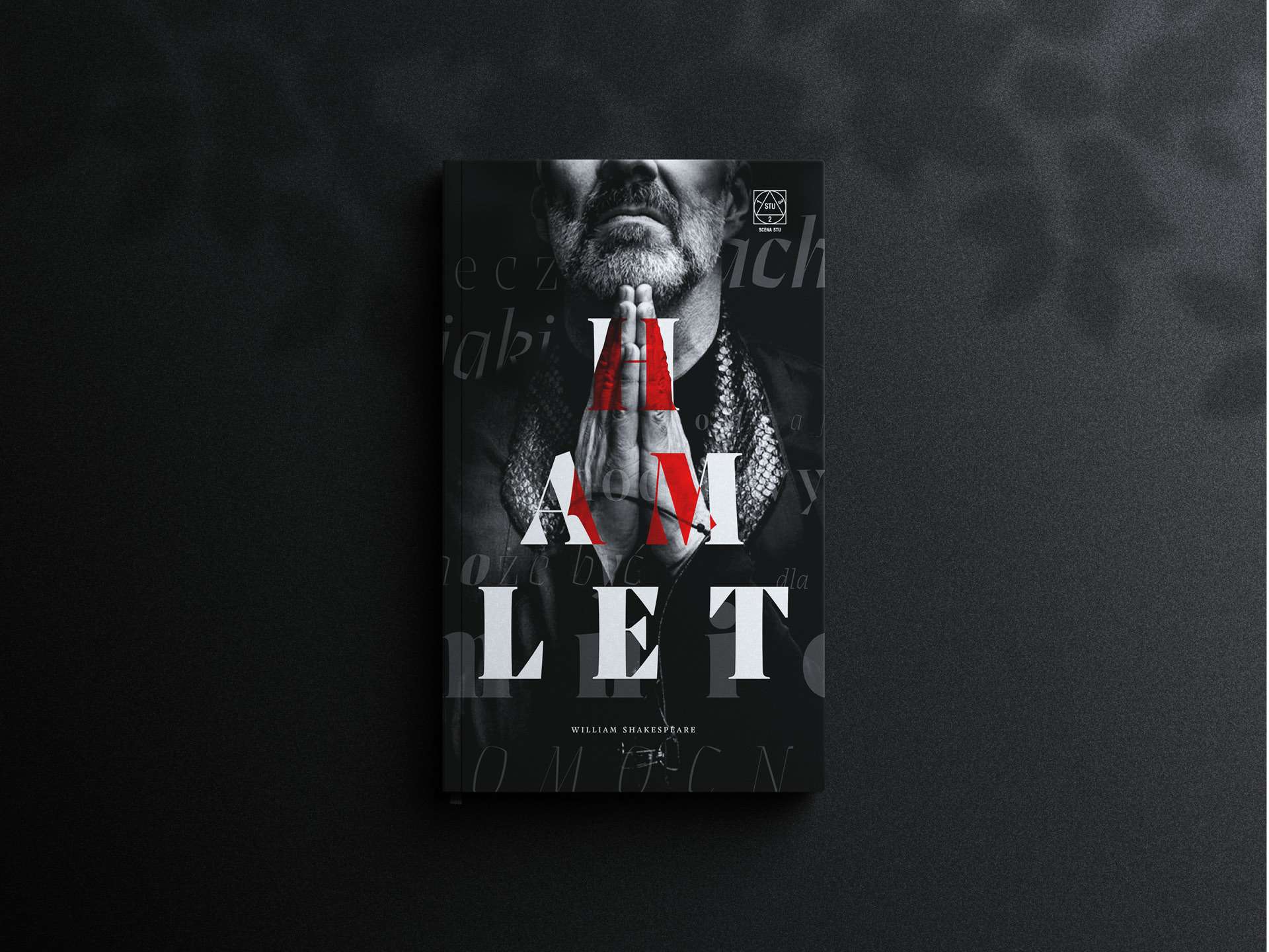
We were deeply inspired by the actors’ ability to transform into so many different characters and deliver their lines in a perfect dramatic manner. To better convey this theatrical magic, we’ve chosen the Prospectus font, using its different variants to emphasize the meaning of titles and quotations.
Solution
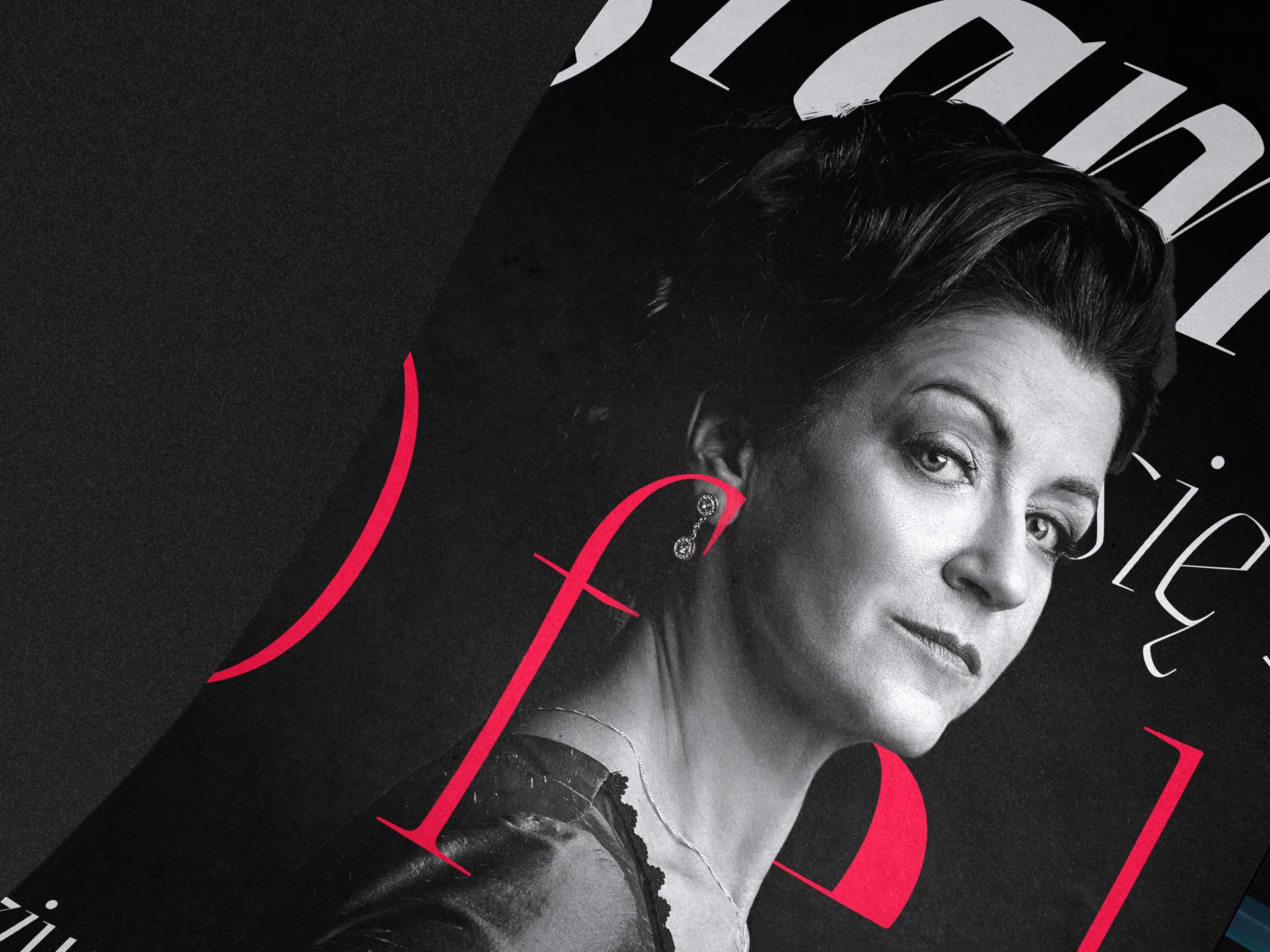
The main concept was built around the synergy between each play’s leading characters and typography, using their combination to further strengthen the dramatic effect. By keeping the background toned-down, dark-shaded, aesthetically undisturbed, and elegantly pure, we’ve managed to successfully accentuate the actors’ faces, expressions, poses, and silhouettes.
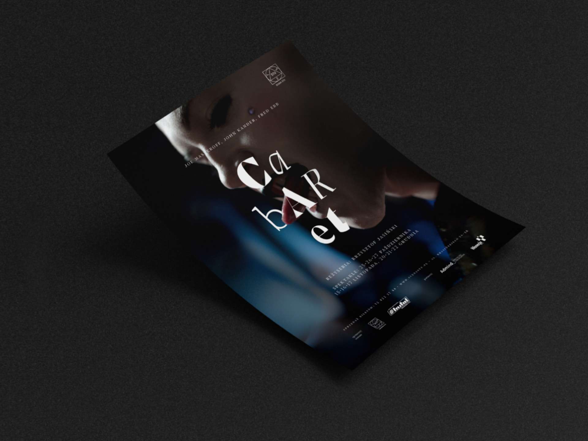
This intentional and deliberate use of the subtle play between uncanny typography, artistic photography, and the intensity of human emotions invites the readers into a mental state similar to that of being in the audience while watching their beloved characters under the spotlight on stage.
Outcome
Thanks to an interesting concept, invented by our designers, and careful execution, a series of promotional materials were created – posters, brochures, press releases, tickets, etc., which perfectly reflect the spirit of each individual play, as well as the entire STU Stage theater. Our goal was to provide theater fans with emotions even before going to the play and we believe we managed to achieve that effect.
Let's talk!