May 08, 2024
Beyond Minimalism: Exploring the Depths of Swiss Design
Share this article

At Admind, we’re big fans of Swiss Design, and we use its classic principles to create brandings that are clear, functional, and really stand out. In this article, we’re diving into what makes Swiss Design so special and what inspires us.
Swiss Design was born out of a desire to communicate information clearly and efficiently. Its roots can be traced back to the early 20th century, but it flourished in the post-World War II era, driven by the need for international understanding and cooperation. The movement’s pioneers, including Josef Müller-Brockmann, Max Bill, and Richard Paul Lohse, believed in the power of design to shape society. They advocated for a universal graphic language that transcended cultural and linguistic barriers.
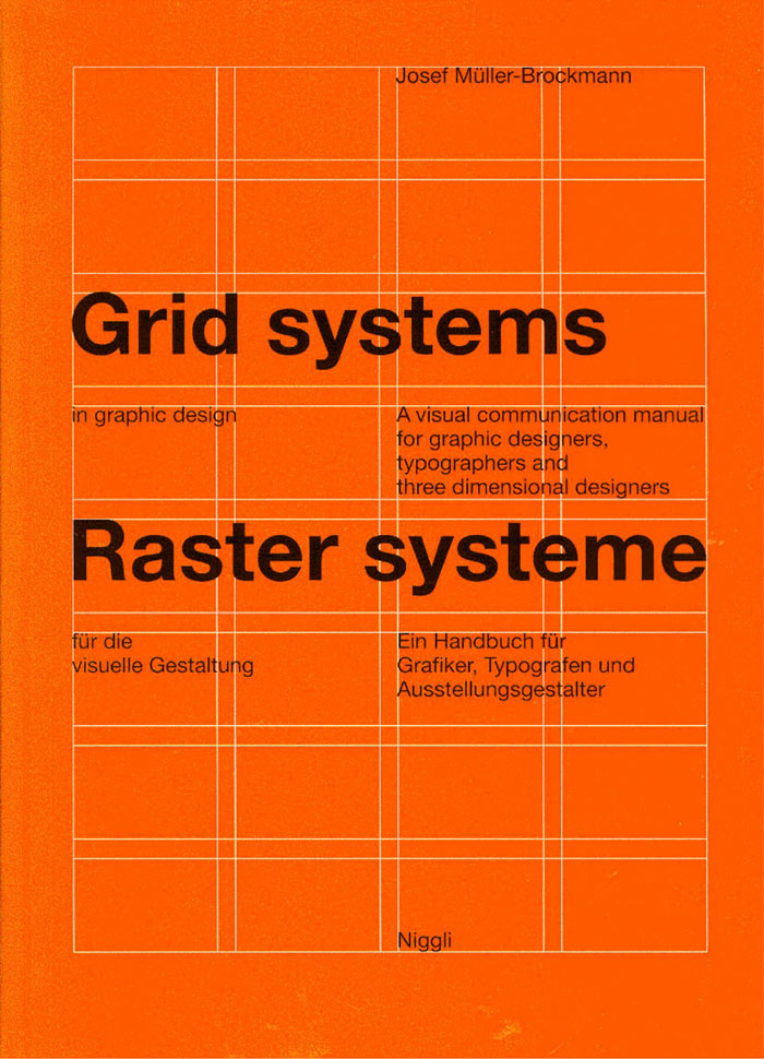
The evolution of the Swiss Style in graphic design is deeply intertwined with the emergence of innovative design principles, drawing inspiration from various avant-garde movements such as De Stijl, Russian Constructivism, the Bauhaus, and the International Typographic Style. A pivotal figure in shaping the Swiss design ethos, Ernst Keller began teaching at the Zurich School of Applied Sciences in 1918, laying down the foundational principles that would define the Swiss School. His teachings and mentorship nurtured a generation of graphic designers who became the pillars of Swiss graphic design. Among Keller’s protégés was Josef Müller-Brockmann, a key proponent of the modular grid system, which he not only incorporated into the Swiss Style but also established as a cornerstone of contemporary graphic design.
The pioneers of Swiss Design were instrumental in shaping the movement’s ethos and aesthetic, leaving a legacy that continues to influence the design world. Let’s delve into the contributions of some key figures and highlight examples of their iconic work.
The legacy of these pioneers is evident not just in the field of graphic design but also in architecture, product design, and digital design, where the principles of Swiss Design continue to inform and inspire contemporary practice.
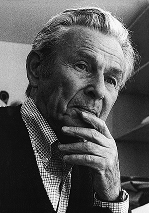
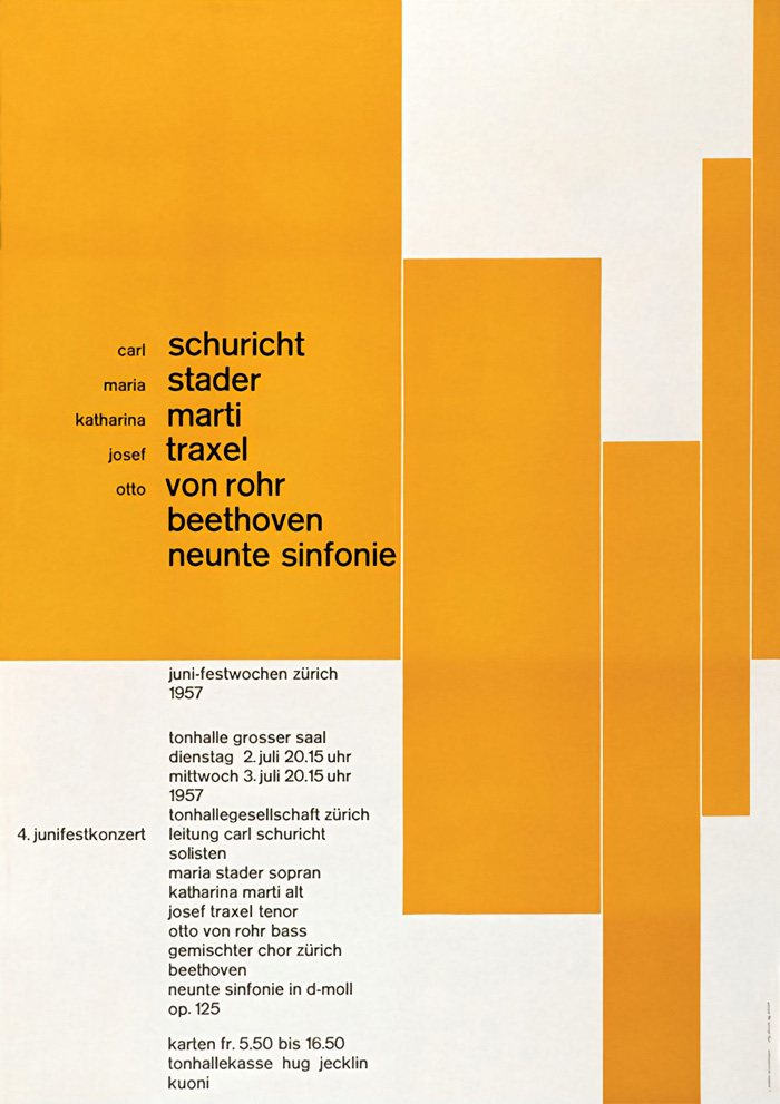
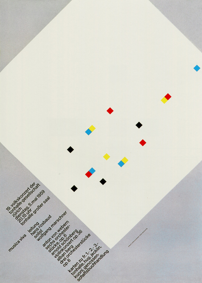
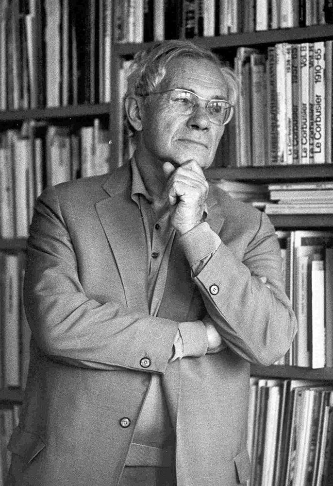
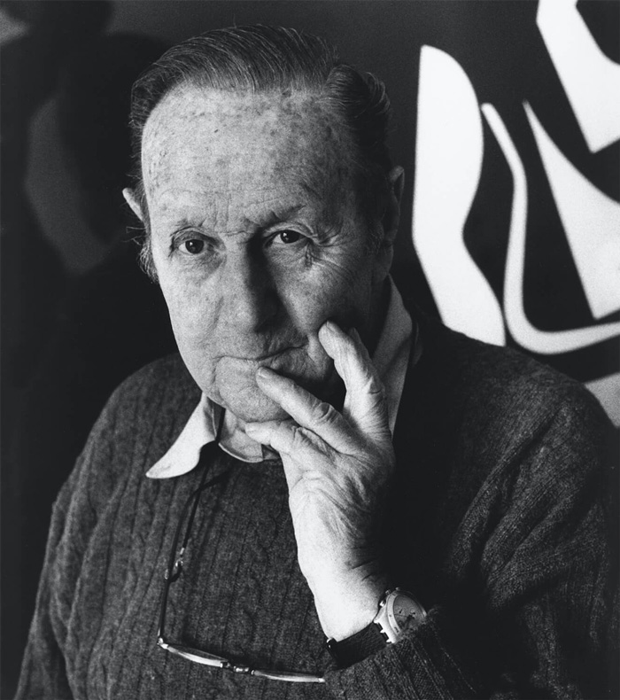
Josef Müller-Brockmann (1914–1996) is perhaps one of the most influential figures in Swiss Design. His work is celebrated for its simplicity, use of grid systems, and emphasis on typographic clarity. Müller-Brockmann’s approach to design was systematic, advocating for the use of grid-based layouts to structure information logically and aesthetically.
One of his most famous works is the poster for the “Musica Viva” concert series, which exemplifies his mastery of grid systems and typographic hierarchy. The poster features an abstract design that conveys a sense of musical rhythm and harmony through geometric shapes.
Images: https://en.wikipedia.org/wiki/Josef_M%C3%BCller-Brockmann
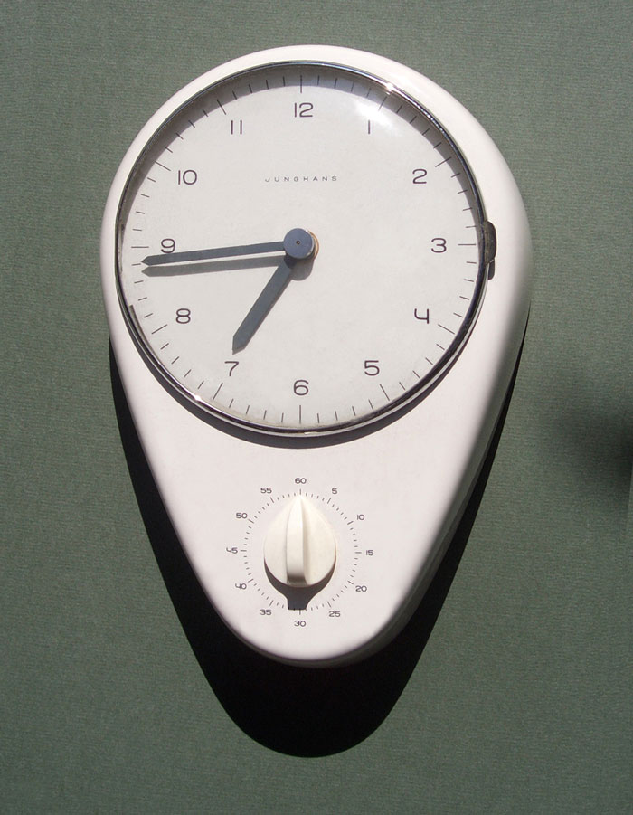
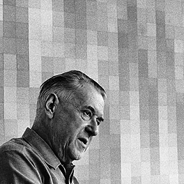
Max Bill (1908–1994) was a multifaceted artist, architect, painter, typeface designer, and graphic designer. He took up studies at the Bauhaus in Dessau under many teachers including Wassily Kandinsky, Paul Klee, and Oskar Schlemmer from 1927 to 1929, after which he moved to Zurich. Bill’s work in graphic design is characterized by a clear, functional approach that reflects the Bauhaus principles of form following function.
His design for the “Junghans Kitchen Clock” in the 1950s stands out as a testament to his minimalist aesthetic and functional design philosophy. The clock features a simple, clean dial with a distinctive, easy-to-read typeface, embodying the principles of Swiss Design.
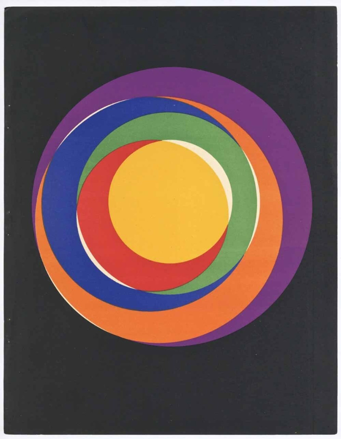
Images: https://www.artsy.net/
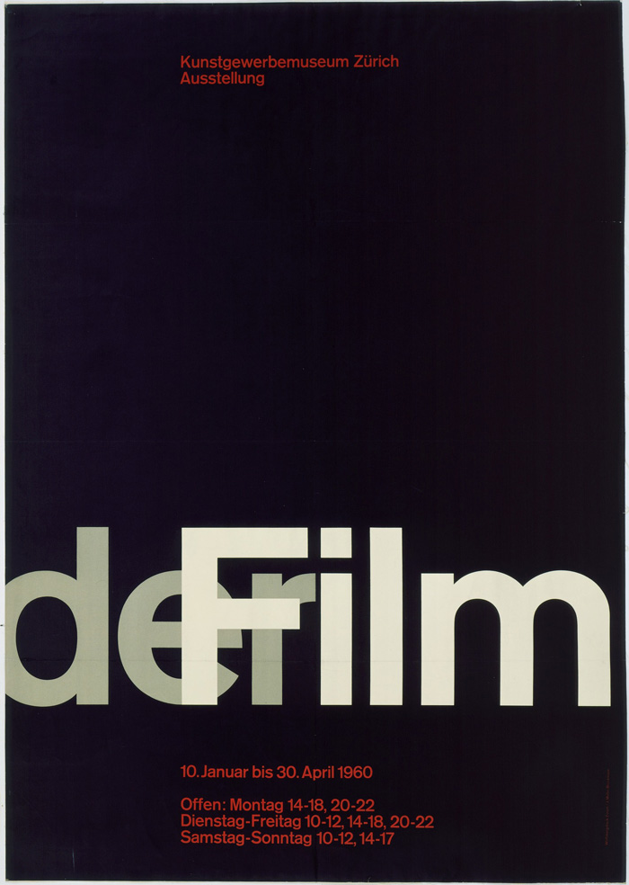
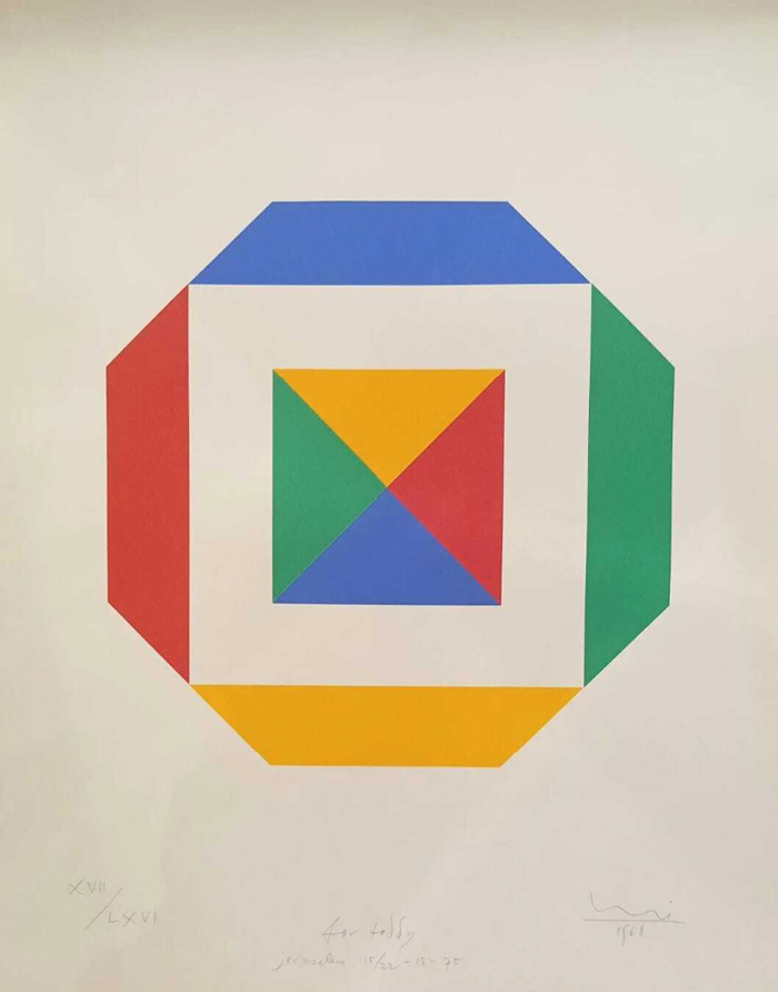
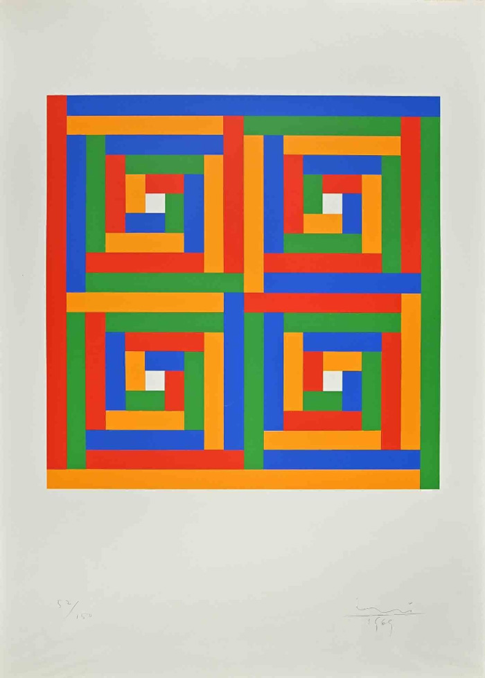
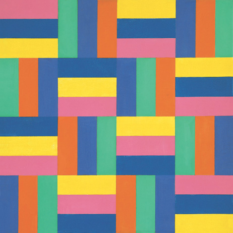
Richard Paul Lohse (1902–1988) was a Swiss painter and graphic designer known for his systematic and constructive art. In graphic design, Lohse advocated for a structured approach, employing grid systems and modular compositions to create works of clarity and order.
Lohse’s posters showcase his systematic approach to design, and feature a grid-based layout with a harmonious arrangement of color blocks and text, exemplifying his methodical and geometric style.
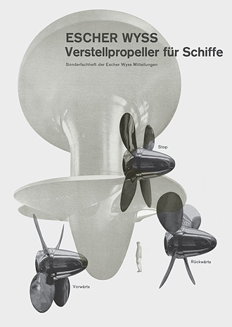
Images: https://www.lohse.ch/entry_e.html
Armin Hofmann (1920-2020) was renowned for his teaching and his philosophical approach to design. His work emphasizes the fundamentals of design, such as balance, contrast, and the use of negative space. Hofmann’s influence extends beyond his creations to his significant impact as an educator at the Schule für Gestaltung in Basel.
Hofmann’s poster for the “Giselle” ballet at the Stadt Theater Basel is iconic. The poster utilizes simple geometric shapes and a limited color palette to convey the essence of the ballet’s narrative, demonstrating Hofmann’s skill in communicating complex ideas through minimal design elements.
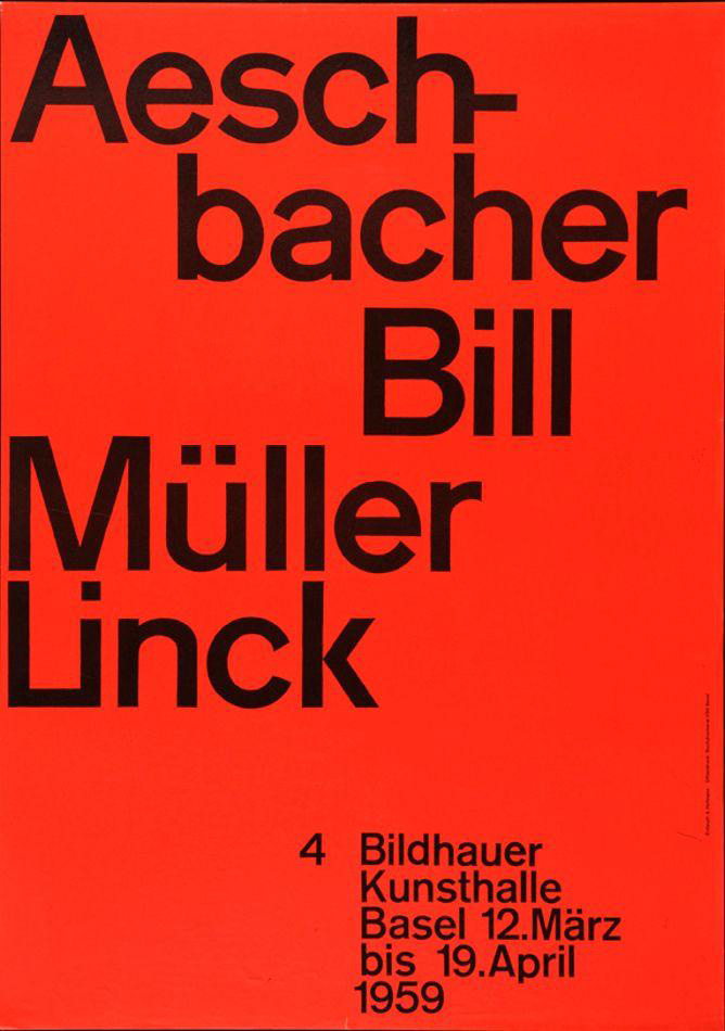
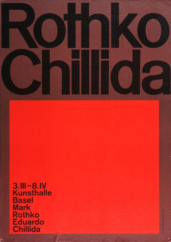
Images: https://commons.wikimedia.org/wiki/File:1959_-Kunsthalle_Basel-_4_Bildhauer.jpg
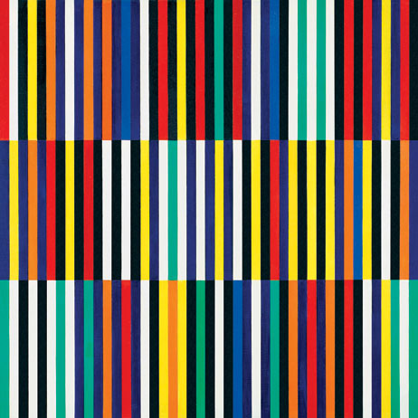
Emil Ruder (1914-1970) stood as a seminal figure in Swiss typography and graphic design. Alongside Armin Hofmann, he was a key member of the faculty at the Schule für Gestaltung Basel (Basel School of Design), marking him as one of the pivotal masters of Swiss Design.
A quintessential example of his work is the design of the “Typographie” book, a groundbreaking text that encapsulates Ruder’s profound influence on typography and graphic design. This work not only showcases his innovative approach to design and typography but also serves as an enduring reference in the field.
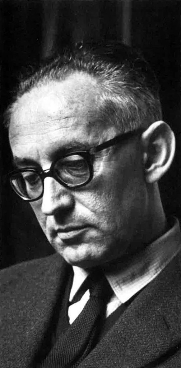
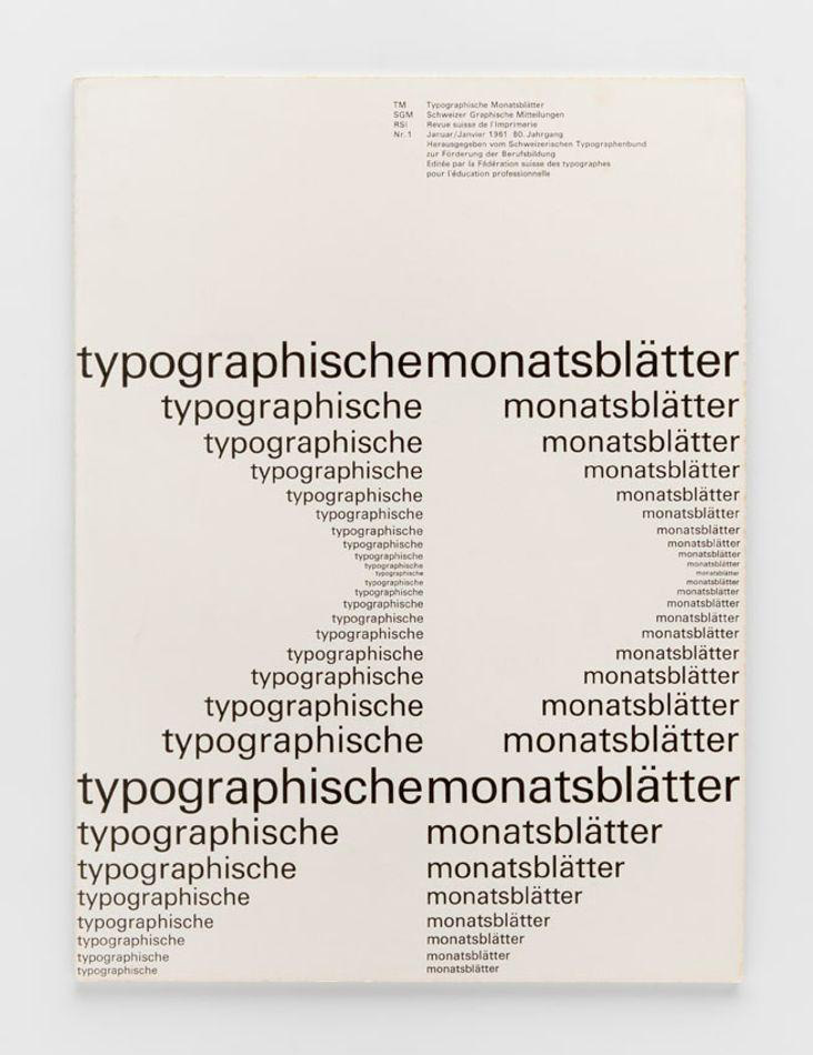
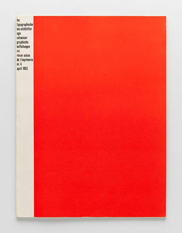
Images: https://commons.wikimedia.org/wiki/File:TM_Typographische_Monatsbl%C3%A4tter_1961_01.jpg
In the context of branding, Swiss Design’s principles offer a timeless approach to creating effective and enduring brand identities. At Admind Agency, we leverage these principles to ensure that our branding solutions are visually appealing and communicate our clients’ values and messages with precision and clarity.
Helvetica, a sans-serif typeface, is a marvel of modern typography that has stood the test of time since its inception in 1957. Created by Swiss typeface designer Max Miedinger with Eduard Hoffmann, Helvetica was born out of the desire to create a neutral typeface that had great clarity, no intrinsic meaning in its form, and could be used on a wide variety of signage.
Originally named Neue Haas Grotesk, its design was rooted in the objective and functionalist ideals of the Swiss Design movement, emphasizing readability and simplicity. Helvetica, which in Latin means “Swiss”, from Helvetia (one of the names of Switzerland), capitalizing on Switzerland’s reputation as a center of ultra-modern graphic design, quickly became synonymous with the values of Swiss graphic design: efficiency, clarity, and neutrality.
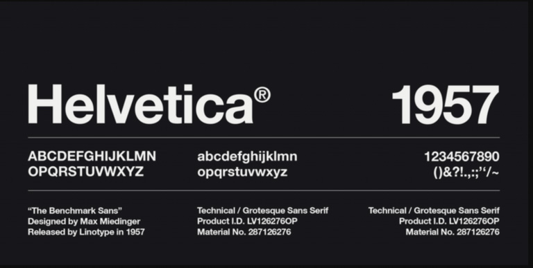
Image: https://doit.wp.txstate.edu/2020/07/02/design-tips-to-elevate-your-powerpoint-presentations/
Over the decades, Helvetica has become more than just a typeface; it’s a cultural icon, embodying the principles of modernist design. It has been the subject of exhibitions, documentaries, and even philosophical debates about aesthetics in everyday life. Despite the emergence of countless fonts in the digital age, Helvetica maintains its status as a go-to typeface for designers seeking clarity, functionality, and timeless appeal.
The enduring legacy of Helvetica is not just in its widespread use but in its ability to disappear behind the message it conveys, proving that in design, sometimes the best choice is one that feels inevitable and unnoticeable. As we continue to navigate through an ever-expanding digital landscape, Helvetica remains a beacon of simplicity and effectiveness in visual communication.
What sets Helvetica apart in the corporate world is its unassuming yet commanding presence. It doesn’t distract; instead, it supports the brand message with understated confidence. This is crucial for brands that seek to establish a connection with their audience without overwhelming them with stylistic intricacies. Helvetica’s clean lines and balanced proportions ensure that the focus remains on the brand itself, rather than the font.
Moreover, Helvetica’s neutrality means it doesn’t carry any inherent meanings or associations, allowing brands to imbue it with their values and personality. This chameleon-like quality makes Helvetica a versatile tool in the hands of designers, capable of evoking a range of emotions and responses based on its usage within the brand’s visual language.
In an era where brand differentiation is key, the choice of typeface can significantly influence perception and recognition. Helvetica’s enduring popularity among iconic brands underscores its role not just as a font, but as a vital element of brand identity that resonates with audiences across the globe. Its continued use in logos reflects a commitment to clarity, functionality, and timeless design—principles that remain as relevant today as they were over half a century ago.
Many globally recognized brands have adopted Helvetica for their logos. Skype, Panasonic, Toyota, BMW, Nestle, and American Apparel are just a few of them.

Although discussion around Helvetica seems like a recurring subject not just for hothead designers, I personally feel like there is no need for glorifying this typeface above any other functional ones that are emerging every single week and are available to use these days. In such a vast environment where usable fonts are not limited only to legibility for screen nor print matter, it’s worth taking under consideration also its expressive aspect. In my personal view, Helvetica as a stand-alone set of glyphs simply does not complement any stories but rather works as a solid workframe for content. We have plenty of font families that are not only easy to read but have more ‘visual meat’ within themself to evoke some emotions around brands. It’s quite exploratory topic but if you’re looking at the assortment of f.e. Swiss Grilli Type or British Colophon font foundries, they have much more in their offering – where letterforms look fresh and intriguing. Every second font from their base seems much more relevant in our times and has more ‘to say than Helvetica.
While being a fan of structured information, I must also admit that the once very modern style is now looking a bit outdated. I love what the current gen is doing with neo-brutalism in graphic design right now. It’s much more vigorous, fun, and has much more personality in its DNA and opens so many doors to help differentiate products and services. To support this point of view I just want to put this comment here that comes from the main frontmen of Swiss Design: “Even though I’m probably one of the last relics of Swiss typographers, I actually think nowadays it’s a dead donkey and we should stop flogging that horse,” – Bruno Maag about Helvetica.“Designers use Helvetica because it’s the lazy choice. And second, it’s also a safe choice. It creates a homogeneity about all the brand and identity work you see. There’s nothing exciting about it.” – Words by Luc Benyon
Swiss Design has left an indelible mark on the field of graphic design, championing an approach that values simplicity, clarity, and functionality. Its influence extends beyond Switzerland, shaping the visual language of the global design community and continuing to inspire designers across various mediums. Swiss Design not only represents a significant historical movement but also a timeless ethos that continues to resonate in contemporary design practices. If you are interested in more insights from the design industry, make sure to read our article about the history of the olympic rings.

